


info
Our challenge was to evolve a renowned Chilean workers’ insurance brand with 65 years of history into the country’s most extensive network of comprehensive care. We created a visual identity that preserves recognition while signaling expanded business segments, a new architecture, and strategy. Core assets—the square and the green—were reinvented, and a broad system of new elements was built across the parent brand and three sub-brands: more vibrant colors for a closer positioning, proprietary illustrations for a simpler tone, two custom type families to reinforce personality, and a photographic style that inspires self-care.
As Chile’s leader in workers’ insurance, Achs has long focused on prevention and recovery, offering medical care and economic benefits for work-related accidents and illnesses through 80+ health centers, a reference hospital, and 7 clinics. Given strong health outcomes—contrasting with a public system seen as inaccessible and low quality—the brand chose to open its healthcare to the entire population, providing high-quality, affordable services in a welcoming network.
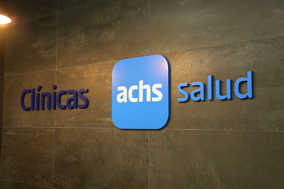
To clarify offerings for diverse audiences, we defined a brand architecture with a parent brand and three sub-brands: Achs Seguro Laboral, Achs Salud, and Achs Servicios. In the new strategy, Achs presents itself as Chile’s largest comprehensive care network, with “Live Care” as the promise guiding its evolution—expressing care from prevention to recovery, at work and throughout life, and a commitment to accessible care experienced by more people.
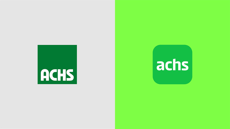
To mark change while staying recognizable, we preserved and refined two assets: the logo square and the green. Guided by the attributes vitality, presence, care, security, and optimism, we intensified the green, added sub-brand colors, and introduced a unifying neon green. The logo square gained rounded corners and lowercase letterforms set in Achs Nueva Sans—a reinterpretation of the original—paired with its sister, Achs Nueva Serif. Completing the system are proprietary illustrations and graphic elements inspired by the logo’s new curves.
Interbrand Latam
Project direction:
Rodrigo Marques
Creative direction:
Gil Bottari
Creative coordination:
Laila Rotter
Brand strategy:
Rodrigo Maques, Alice Araújo, Tainara Crepaldi, Andrea Barrueto
Design:
Gabriel Deda, Laila Rotter, Taís Andrade
Copywriting:
Alice Araújo e Tainara Gomes
Type system:
Ana Laura Ferraz, Carlos Mignot, Rodrigo Saiani (Plau Design)
Illustration:
Tomas Olivos