


card


info
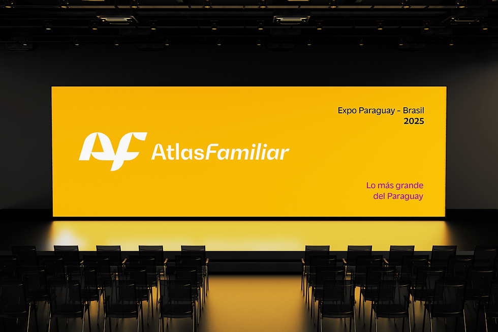
Once confined to boardrooms and annual reports, banking consolidation took center stage in Paraguay with the merger of Atlas y Familiar—an encounter of histories, cultures, and expertise that demanded a unifying identity: one that honors two DNAs while opening a new chapter. The ambition was clear: a brand that feels mature, close y digital—familiar to clients of both banks yet unmistakably fresh.
The turning point begins with the symbol. A simple, powerful discovery anchors the whole system: the letter “y”—the Spanish additive conjunction—revealed in the negative space between A y F. It transforms the logo into a manifesto, showing union where curves meet straights and duality becomes direction. Empático y moderno. Fácil y rápido. Seguro y próximo. The “y” drives the idea, unfolding across every touchpoint—from product interactions to institutional spaces.
Color signals a shift in posture. In a field ruled by predictable blues, yellow—once a supporting tone—steps into the spotlight as primary. It acts as light: bringing visibility, confidence, and distinction, balanced by black, white, and warm grays that ensure accessibility and performance on all media.
Graphic language emerges from the symbol’s anatomy: a rising diagonal that expresses progress. It organizes layouts, guides transitions, and frames information. Typography reinforces this precision with Massilia—human yet digital, solid for reading, expressive in headlines, speaking to seasoned investors y new users in a direct, warm voice.
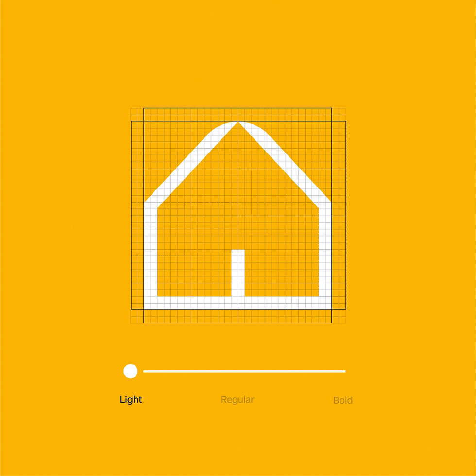
Iconography adds operational strength. In three weights—Line, Duotone, Solid—icons follow the monogram’s logic of curves and straights, ensuring clarity and consistency. Tied by grids, tokens, and clear rules, every screen, card, and campaign conveys the same message: distinct trajectories meeting to form a greater whole.
The result: a brand where the “y” between A y F is no longer hidden—it’s the essence of union made visible.
Interbrand Latam
Creative Direction:
Gil Bottari, Beto Almeida, Leandro Strobel
Design:
Gabriel Deda, Tais Andrade, Kauan Miranda
Strategy Direction:
Elaine Baio, Beto Almeida
Brand Strategy:
Alice Araújo, Sofia Matsui
Copywrting:
Luiz Leite
Banco Atlas Familiar
Marketing Team:
Maria Luján, Elias Nicolas Sanchez, Vanessa Gutiérrez, Marcelo Fabian Oliveira.