

info
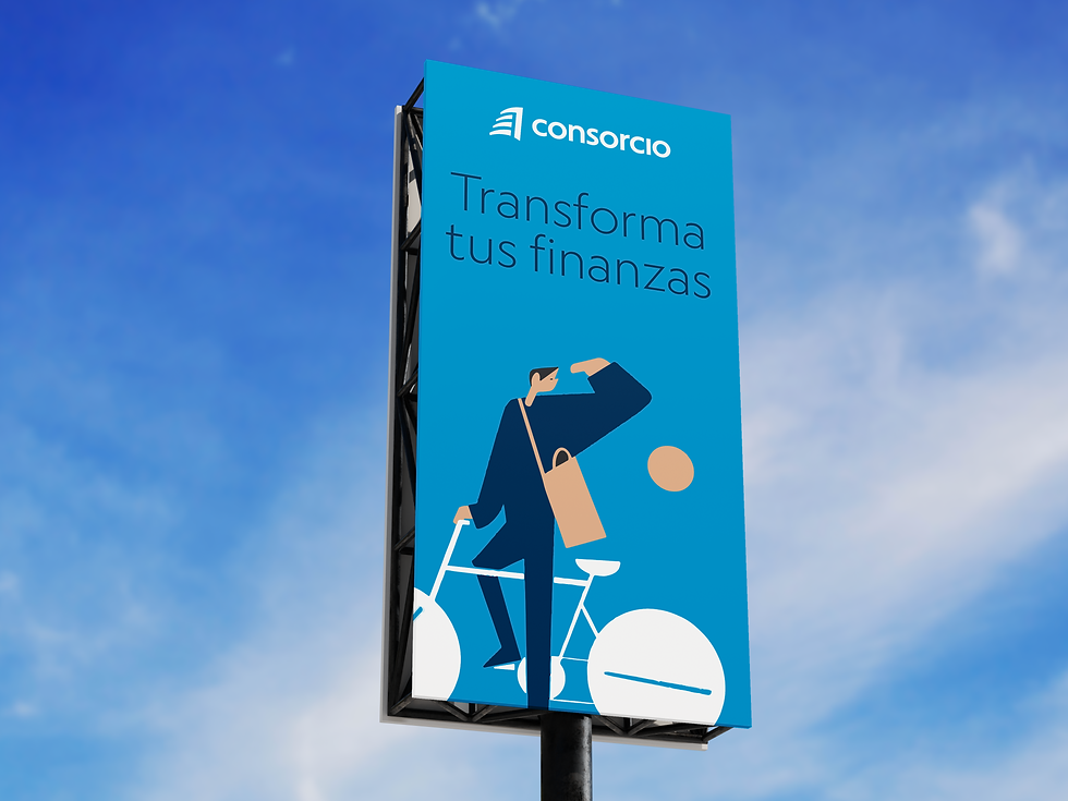
For Banco Consorcio, the 2024 brand refresh united a century-old financial group under a more digital, approachable identity. The updated wordmark adopts lowercase typography for warmth and clarity, while a new symbol draws directly from the company’s corporate headquarters—turning a real, lived landmark into a distinctive, ownable asset across Seguros, Banco, Inversiones, Previsión and Salud. This “building-born” icon reinforces trust and proximity while aligning with a modern, screen-first ecosystem.
The building’s role goes far beyond inspiration. The Consorcio headquarters in Santiago—designed by Enrique Browne and Borja Huidobro—has long been recognized as a metropolitan landmark, celebrated for its green façade concept and strong urban presence. By elevating this architecture into the core of the identity system, the brand anchors its promise in something Chileans instantly recognize in the skyline, strengthening memory, differentiation, and place-based authenticity.
In practice, the redesign clarifies the customer experience across every touchpoint. The simplified symbol scales cleanly from app icons to bank cards and branch signage; the lowercase typography improves legibility on small screens; and the cohesive system helps customers move fluidly between business lines without losing their bearings. The result is a brand that feels consistent, human, and distinctly local—rooted in a building that has represented Consorcio for decades, now reinterpreted to meet today’s digital expectations.
Interbrand Latam
Creative Direction:
Gil Bottari, Beto Almeida, Leandro Strobel
Design:
Gabriel Deda, Thalles Ferreira
Banco Atlas Familiar
Marketing Team:
Nicolas Bunster Zegers, Rodrigo Gonzalez.